After spending two years as the Lead Concept Artist on Warhammer Online, I was asked to take over the UI design. It was about 6 months before we planned to release the game, we had completed the bulk of the concept art for the game, and Michael Phillippi was ready to step up as the new Lead Concept Artist.
We needed to do a ground up redesign of the UI in 6 months (it turned out to be more than 8). The UI for an MMO like WAR is a huge piece of the game, almost like an OS for the game. Beyond the HUD (which is very complex in itself) it has maps, chat, mail, a social network, maybe 50 windows total. . . basically everything you would find on Xbox Live and more.
The reason I enjoyed this gig was because I had the opportunity to come up with original features. One that made it into the game was the Open Party system. Players in WAR can see a list of groups sorted by distance, and just join up with them in one click. This makes playing WAR’s open RvR gameplay much simpler because you can find people nearby who are playing the way you want to play, be it fighting other players or fighting monsters.
I think there is a lot more we could have done with this system, and there are arguments to be made that it actually reduces community stickyness in the long term, but I think it’s a huge improvement over the old LFG standard, and a step in the right direction. This kind of functionality is a big interest of mine going forward – how do we take players playing cooperatively and help them form longer-term connections? Are open guilds the next logical step?
The process for building the new UI went like this:
Phase 1: HUD Sketching
My first step was to lay out the main HUD – the things you see on screen at all times. I sketched their shape and put them together in several “wireframe” layouts that looked like this:
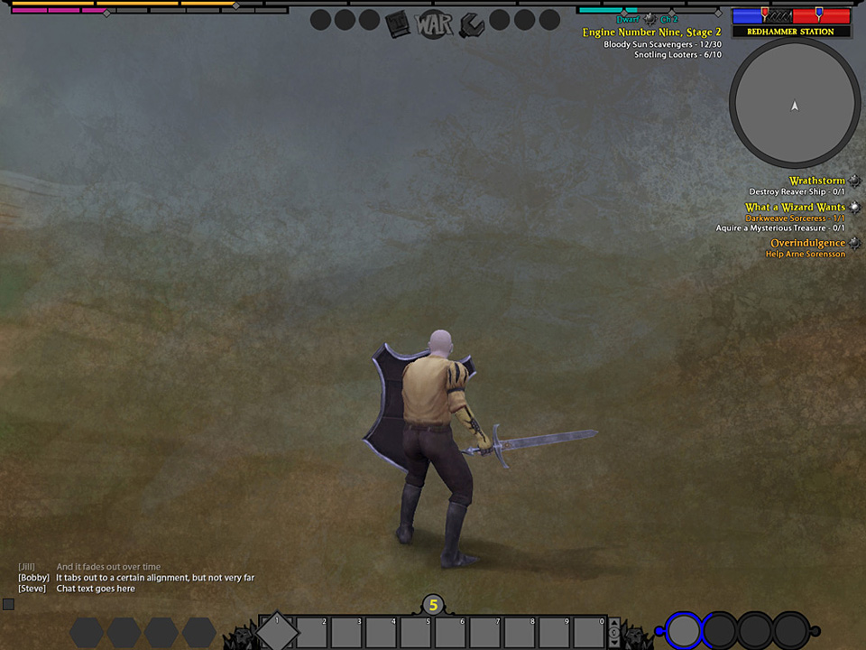
These wireframes served several purposes:
- They were quick to make and remake
- The elements could be positioned in lots of different ways to see what worked and what didn’t (it’s in this phase that all MMO UI designers discover that there are a lot of good, undeniable reasons behind WoW’s UI layout, and despite all of our best efforts, unless our gameplay is fundamentally distinct, our UI’s will look somewhat similar).
- The wireframes could be shown to producers for approval. We didn’t get many change requests, but this buy-in bought us some armor for later on.
One goal of mine was to keep the UI seperated into chunks. Earlier iterations of our UI had looked like a more integrated “dashboard.” The modular approach gave us several benefits:
- We could build modability into the game. Instead of needing to download UI mods, users could move their UI around into whatever layout they wanted inside the game.
- One of these options could be to add tons of hotbars – one of the first things advanced MMO players want to do.
- We could start the game off with lots of things hidden (we are still getting this in). New players would see a very very simple UI, while elder players could show as much complexity as they liked.
My biggest challenge here was trying to keep all of our progress bars from competing visually. In most MMO’s you gain XP. In WAR we have XP, Renown, Influence, Victory Points, Morale, and some classes have a combat mechanic that fills up over time. . . yikes.
The other major challenge was groups. In WAR you will often find yourself in a Warband with 23 other players, which can look like this:
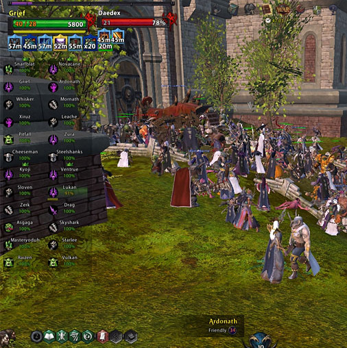
We made it look like that because it’s good to keep tabs on all of those people if you are playing in a highly organized Guild. It’s also good if you are a healer and you need to know if somebody is dying. But, most people don’t give a crap about all of that information, they just want to know how many people they are grouped with and if they are dead or not. I think we could have done better with this by keeping more clutter off the screen and offering the option to “show all.”
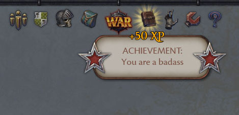
There is also something clunky with the quest tracker and all of the event announcements we do (things like achievements and “You Have Entered:” messages).
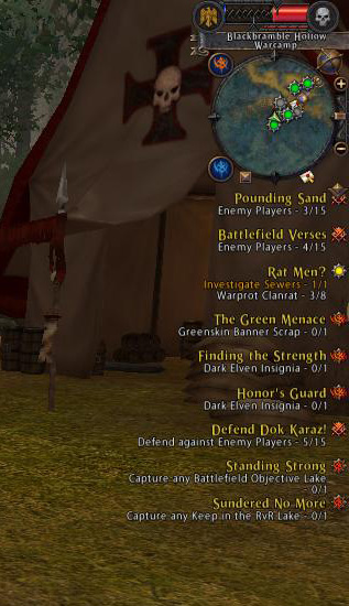
There’s way too much information presented for it to be interesting, but I’ve never been able to settle on a solution that works elegantly. I think there’s something to be found in news feeds, fading information over time, and separating the information by the icons we use in the main menu:
Phase 2: HUD Design
After settling on the wireframe layout, I worked my way around the screen texturing all of the individual elements and giving them detailed designs. By mocking up every possible state of the object I gained two valuable things. The mockups were both a detailed functional design and all of the art assets needed. I would put these mockups together into documents that we could give to programmers and to producer-types for final approval.
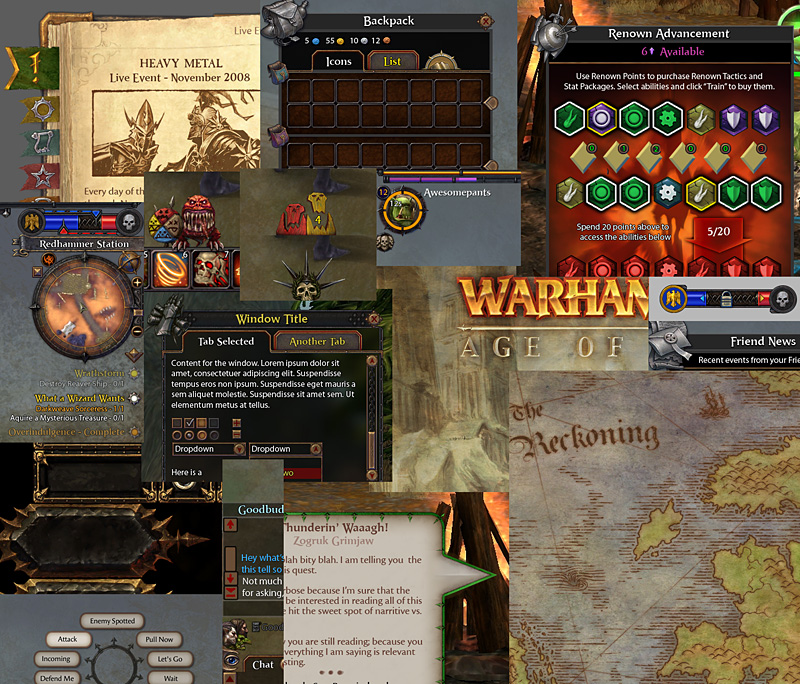
After we wrapped on the HUD, that same process rolled right into all of the windows. Here is a smattering of some of the mockups I did:
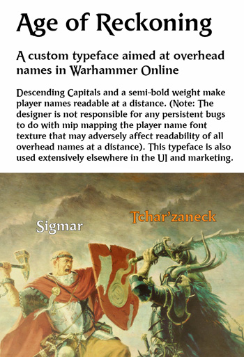
There were some interesting tasks that came up during all of this. I made a custom font for our player names, called Age of Reckoning.
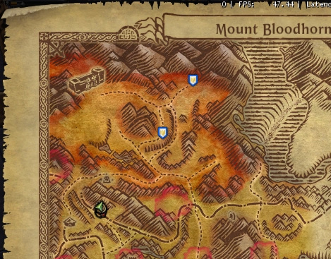
I developed the style for our maps and a workflow that allowed us to cheat and complete 30+ of them very rapidly.
Here’s an early mockup that I’m also fond of, I think it captured a nice warhammer feel:

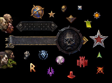
There was a metric assload of tiny icons to draw. There were probably 20 artists who pitched in on the various sorts of icons.
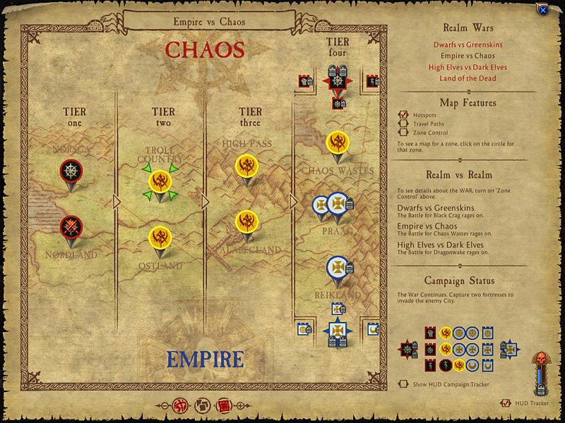
The UI touches all aspects of the game, so it was a great education in MMO game design. Everything from the second-to-second flow of combat in the action bars to the months-long metagame of the campaign was under our noses:
![]()
![]()
I had some other pet features that never made it in (we only had 6 months!), but I’ll restrain myself from posting them publicly. Ask me sometime about the quick commands ;)
That’s the overview of my role in the team as the hybrid designer/artist. There were a lot of fine programmers working with us, as well as Terro Veun, the other UI artist, and Carrie Gouskos, the UI lead. Given what we were up against, I am extremely proud of what we were able to accomplish.