I recently gave a short talk on Photoshop Custom Brushes here at EA Mythic (I might post about that another time). I started off talking about stylization and ended up rambling for quite a while. I think the subject is big enough to deserve a post.
What I’m going to say here has been said before by many others and probably said much better. But, this version is focused squarely on how stylization relates to games. What I’m interested in is how to make a game more attractive and make it cheaper to produce with a single style.
Games Need a Unique Approach to Stylization
Games are so dense with content these days that the old ways of polishing every pixel are dead and gone. As artists, we’ve got so much canvas to fill that we don’t know what to do with it. Most game developers have scaled up their time-tested techniques and continue to grab photosource for their textures, relying on it more and more to fill in the big canvas. But the old techniques don’t hold up in HD, and we end up with hi res crap.
Just look at what idTech5 has to offer with Megatexture technology and it will be obvious that the biggest constraint put on us as game artists is no longer finite textures or polygons, but technique. How well can we fill the space we have with the limited time we have? Don’t spend time on every pixel, just the ones that are important to the final frame.
Special Effects houses like ILM have always had big canvases. They go and photosource and game artists see that as good justification for using the same approach. The difference is those guys are typically matching live action, real world footage. Game art is more comparable to what Pixar does.
But, there’s a problem with Pixar as well. They have a Renderman, pure-CG heritage and tend to use things like procedural textures. They can get away with it because they combine them with complex, layered materials – things game artists have to fake and bake into textures.
Gameplay is not going to be mistaken for real world footage, so the art should match it through stylization. But we still have enough constraints in our renderers to prevent us from copying our big brothers in film. The world of games needs an approach to stylization that is all its own.
Immersion is Believability, not Realism
There’s a funny thing about style. It is individual expression – nobody is really going to understand where a particular visual style grew from just by looking at it. But, paradoxically, people will nearly instantly notice something that clashes with a given style. Its as if your subconscious groks style while your conscious mind remains blissfully unaware of what is going on under the skin. Why does this happen?
Stylistic consistency creates its own internal reality. You don’t need actual ‘realism’ to create the holy grail of gaming immersion. You just need two things:
– Believability
– Consistency
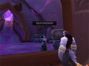
Consistency lets you get away with big fat painbrush strokes across your textures. It sets certain expectations in the players head. Now, if they encounter something that is smudgy or cartoony, their imagination fills in the blanks. If you do it everywhere, nobody will notice. For an example, look at WoW.

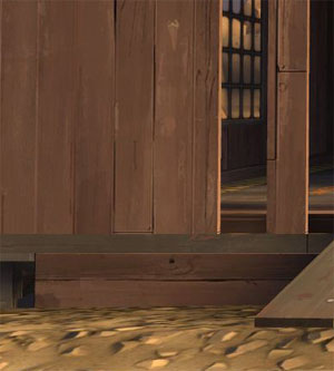
Believability means that those paintbrush strokes have to be just expressive enough to let your eye know what kind of surface you’re supposed to be looking at. Is it wood or stone? That’s it. Pass that test and your world is believable enough. Another example: Team Fortress 2.

Consistent stylization is going make your game more immersive than trying to be the extraordinarily rare game that achieves that next leap in virtual realism. Good stylization is a win every time. Realism is trying to break the world record.
The correct progression is not 2D -> 3D -> Normal Maps -> Virtual Reality.
Lots of folks fell off the train at Normal Maps. They were overreaching, missing the point. I’m looking at you: Everquest 2.
The goal has always been believability; The Illusion of Life. It just gets confused with realism sometimes.
Win Win
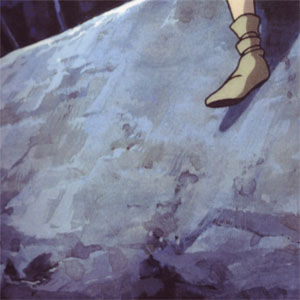
So, stylization lets you make a great looking game. That should be enough for you to explore establishing a unique look for your game. Yet, the biggest benefit comes when you can establish a style that gives you a visual shorthand. Look at this cut out from a Studio Ghibli background painting.

The stylization gives the movie backgrounds character, but it also let the background painters avoid detailing the whole painting. They let their brushstrokes show through, which also lets the viewer appreciate the hand-crafted expressiveness of the painting.
For a game: Just because some other game out there has every pore of a character’s skin in their textures, or every gritty grain of sand shown on the ground, doesn’t mean you have to. You can choose a style of that lets you emphasize what is important to your particular game, and smudge over the rest.
This can mean massive time savings, and it will let you accomplish greater things in the areas that matter.
Final Words
There are two key elements to successfully coming up with a great style for a game.
1: There are infinite visual styles to choose from. The best choices for games are the ones that let you take production shortcuts and also look great under the limitations of modern game renderers. An understanding of shader and lighting tech is necessary if you are going to establish a style for a game. Any illustrator out there is going to be able to come up with a cool, unique style. What’s challenging is coming up with a cool, unique style that is easy to implement in your game engine.
2: Figure out what is most important in your gameplay and emphasize that with the style you choose. Deemphasize everything else and establish firm restrictions on how much work can go into the unimportant things. This will help your fellow artists from getting too precious with something the player should not be looking at.
When they make good decisions, Art Directors can not only immerse players in the game world, but they also have more time to make the game look great. Style, when done right, is substance.
——-edit——–
The discussion has shown up on Polycount, here.