I wrote this as a reply to somebody in a forum recently and I thought it was worth re-posting here. The OP was asking about why we always see the same color palettes – Teal&Orange and Brown – over and over again. Here’s what I replied:
The reason a lot of movies are color graded Teal/Orange is because skin tones are in the orange range of hues. If you take everything that is not faces or in a similar color space to skin and push it in the opposite direction (complementary colors, natch), you get teal. Now, your eye is naturally drawn to look at the faces and not the unimportant scenery. Warm colors draw your eye more than cool.
This works for movies because the colorist can key the grading off the faces in every single shot. If the face is lit by blue skylight in this shot, that’s ok, just key the grade off the face. If the face is lit by warm incandescent light in this shot, that’s ok, just key the grade off the face.
This technique is tougher to do in games where the color grade just gets baked down to a single LUT for all lighting situations. That’s the answer to your question. Instead we usually go for a more general color grade – one more balanced, or one more warm and appealing (the brown look).
Another reason teal/orange works for movies is because the faces are almost always the most important thing in the composition. Faces are warm and warm colors draw the eye, thus teal/orange. In games we often care more about an entire character wearing a costume, or an inanimate object. Often in games we have a lot of dirt.
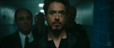
In movies, not every object in the background has been colored specifically to fit within a palette. In games you can texture everything to a specific palette (this is not always done in games, but it is possible). The teal thing is more necessary in movies to unify the palette of the scene. I really don’t care about the doors behind Iron man in the shot above, so make them all teal to blend in with everything.
When games do teal/orange, it’s more often an attempt to ape the aesthetic of a movie and elicit the same tone.
Why don’t we see more color variety in games? Why does it have to be just two colors (teal/orange) or one (brown)?
Lots of the games you reference go for an aesthetic of high detail. High detail is often targeted in AAA art direction as a shorthand for MOAR GRAPHICS – we have the best tech, the highest fidelity, the most future in our codes. Sometimes, this is actually true (Gears of War, Battlefield). Often, this is weak art direction.
Lots of these games also have high value contrast, like Saving Private Ryan, to give more of a ‘wartime’ feel. They are super explodey combat games, so this is appropriate.
If you have high detail and high value contrast, adding in a complex color palette would be a mistake.
It’s a matter of contrast. Artists use contrast to draw the eye. There are lots of forms of contrast:
– Value contrast (black and white)
– Color contrast (lots of different hues, strongly complementary colors up against each other)
– Edge contrast (lots of detail)
– Temporal contrast (any of the above over time)
If you have high contrast of all types across the whole scene, you have visual shit.
So, the games you see with more colors are usually the ones with less value contrast or less detail.
