The first one is for a would-be game of mine called Starfunk. It’s a space opera with a strong infusion of modern music and a visual style of psychedelic color mixed with retro sci-fi illustration. I hope to do some concept work for this universe someday. (click the logo to enlarge)

The papercraft style treatment is ripped from a radial gradient tutorial I saw on the web, but I used it a differently for this logo.
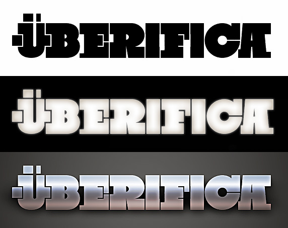
The next one here is from a little hobby of mine. I keep a list of names for my super awesome game development studio that I’m going to start after I make my first billion. One name near the top is Überifica.

Based on Black Slabbath, the pixel-block nature of the Ü letterform will make a great icon. In the middle is my favorite color treatment, and the bottom is a little retro tribute to the demo scene.
On Warhammer Online: Age of Reckoning, one of the first things we did was work on the logo. We had to because the game had been announced before we ever started working on it. We did the logo so early on that the marketing team and executives couldn’t even be sure of the final name of the game. They knew that they wanted it to shorten to “WAR,” thus the “Age of Reckoning” bit. But, they weren’t positive that “Warhammer ONLINE: Age of Reckoning” wouldn’t become WOAoR, which is a really stupid name. So, the first logo I did was using this name:

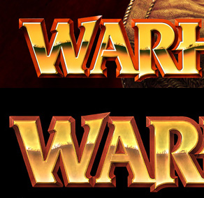
There are two bits of work that survived to the end from this. First, I used the shield and hammer from the Warhammer rulebook to anchor the logo, after giving them a repaint. Second, I repainted the classic WARHAMMER logotype to lessen the color contrast and give it a more textured, tangible look. Here you can see a before and after:

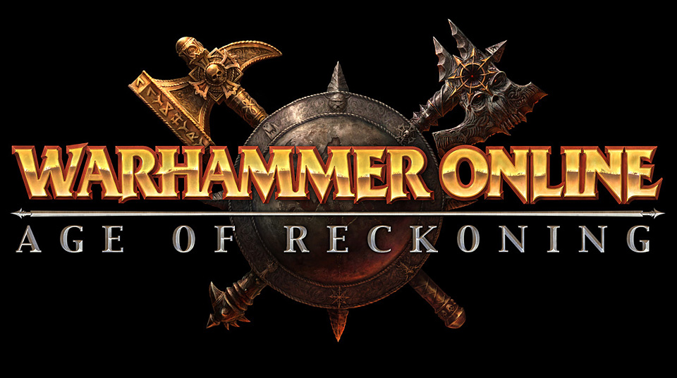
Later on, when we saw that the marketing folks had done a “final” logo, we took it and did another polish paint pass on it. At this point they had decided to add “ONLINE” back in, so I repainted that bit as well as the “Age of Reckoning” text. Michael Phillippi did a final pass on the shield and hammer, as well as painting the awesome Chaos axe to go along with it. Thus, the final logo:
